Grocery UX Case Study
Researched and designed a mobile grocery shopping app that makes shopping trips simpler and more efficient for busy users 🛒

Project Type:
Academic UX Research Project
Category:
UI Design, UX Research
Timeline:
Jun - Aug 2023
My Role:
Lead Researcher and Designer
The Challenge
Grocery shopping can be time-consuming and overwhelming, especially for users balancing busy schedules. Existing shopping experiences often make it difficult to stay organized, locate products efficiently, and plan trips effectively, creating unnecessary friction during an everyday task.
Objectives
Design a user-centered grocery shopping experience.
Help users plan shopping trips more efficiently.
Reduce the time and effort required to complete common shopping tasks.
Validate design decisions through user research, prototyping, and usability testing.
Research & Define
I executed a competitive analysis between 2 major grocery chains: Raleys and Safeway. Then, I implemented that information into an affinity diagram, uncovering main user types.
Next, I defined common pain points for users, such as balancing family life and cooking, and simplifying the shopping process.


User Persona
Represented the needs, goals, and shopping behaviors of my target audience.

Ideate
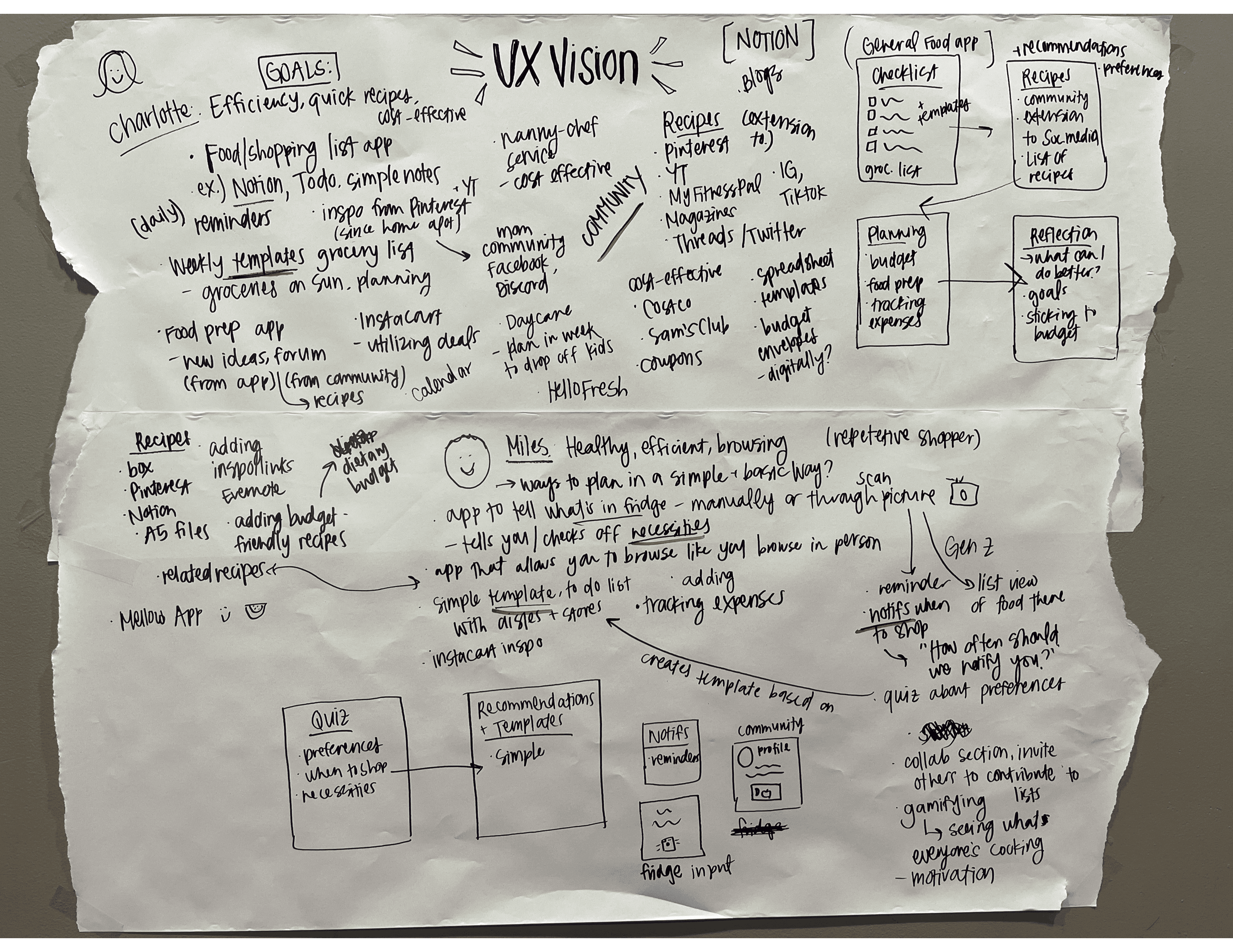
I facilitated a collaborative "UX Vision Workshop" brainstorming session with two individuals to capture ideas for the product. Then, I created three storyboards to map out common user scenarios. These helped uncover potential features and typical tasks of a user.

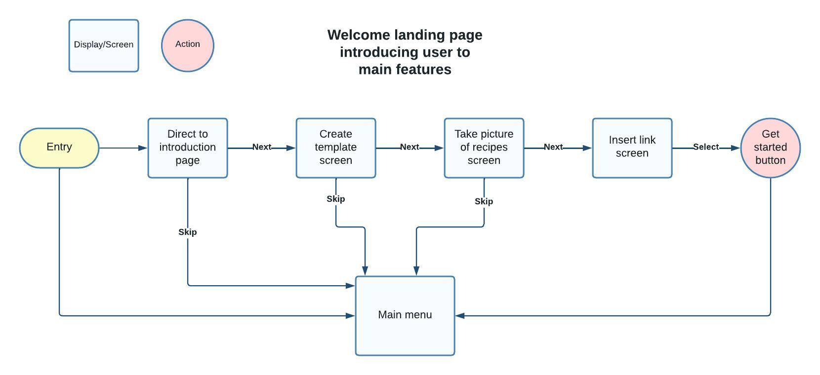
User Flow
Mapped Mapped a user's journey through key tasks to create a logical navigation structure.
Paper Prototype
I translated initial concepts into a low-fidelty prototype to evaluate usability before moving on to a digital prototype.

Usability Testing
I created a digital prototype and conducted usability testing, which highlighted issues and possible solutions, listed below:
Users skipped over the "Discover" recipe section because they wanted to create a grocery list right away.
Users wanted categories to be grouped more intuitively. For instance, they confused "lists" and "templates."
Users expected a "+" button to immediately create a shopping list instead of opening up a menu.
Redesign
These findings directly informed the following design improvements:


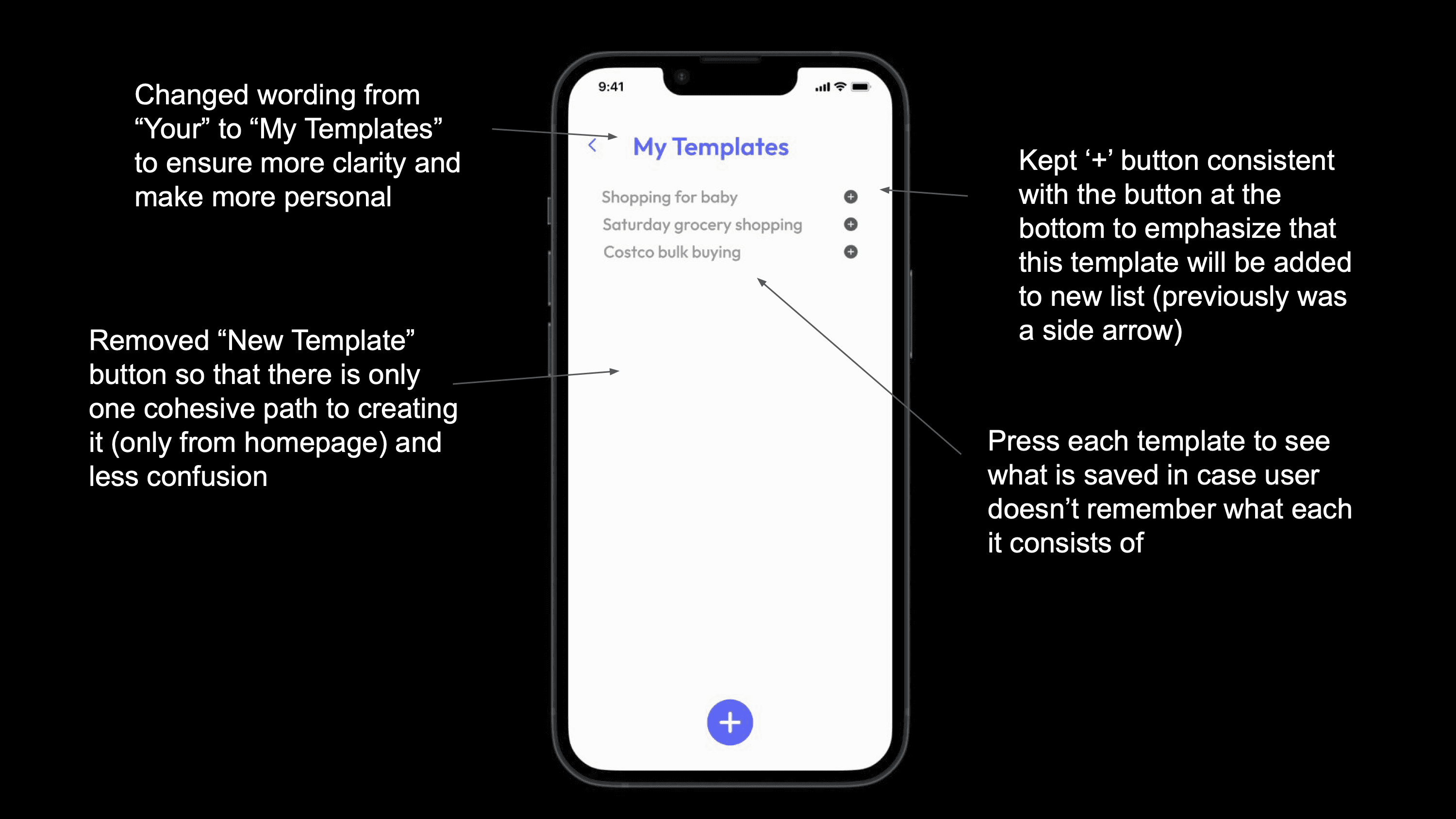
Final Prototype
The final digital prototype incorporates insights gathered through research and usability testing, resulting in a simplified grocery shopping experience.

Key Findings
Users appreciate one natural flow from screen to home screen, instead of the ability to jump from one different screen to another.
Users still like the ability to customize lists even if they create a template. This shows the importance of a flexible design.
Although users desire for a simplified experience of creating shopping lists, they still appreciate more options/interactions even if they don't interact with it in the moment.
Skills Demonstrated
Figma, Design Thinking, User Research, Ideating, Wire framing, Prototyping, Problem Solving, Visual Communication